Guidelines/rules:
• Don't rate someone's siggy and avi low just because you didn't like the rating they gave you previously.
• Don't purposely mock someone's avi or signature because you don't like it. Constructive critisizim is allowed, but don't make someone feel bad.
• Lastly, all of Elde's site rules apply.
Eldemore
Free adoptable pets
Mods lock
5 posts
• Page 1 of 1
Mods lock
![]() by ice❄️ » Wed Jul 26, 2017 8:50 pm
by ice❄️ » Wed Jul 26, 2017 8:50 pm
this is basically a game from cs, rate the signature and avi above you 0-10!
Last edited by ice❄️ on Tue Aug 01, 2017 11:22 am, edited 1 time in total.
-

ice❄️ - Posts: 548
- Joined: Sat Apr 22, 2017 7:40 pm
Re: Rate the signature and avatar above you!
![]() by Coyote » Thu Jul 27, 2017 2:05 am
by Coyote » Thu Jul 27, 2017 2:05 am
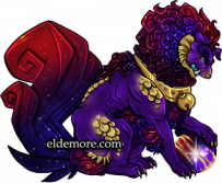
- Avatar: 8/10
I love an avatar that matches a person's username and signature. This one is animated, so it gets extra points from me. Plus, it's cute. Like, that tongue! Overall, it gets a high score from me.
The one big flaw I see is that the GIF isn't looped very well. There is frequent and persistent jerking as the animation "resets", and that jerking in the frames is kind of distracting. It could be remedied either by trying to match your reset better so that the last frame flows more smoothly into the first frame, or by making the overall animation longer so that the "jerk" doesn't happen as often and is easier to ignore. The GIF in your signature does a good job at keeping the animation long enough that the reset doesn't matter, if you wanted an example.
Overall, it's a nice avatar that does its job well. I think it's great!
Signature: 9/10
Almost perfect! It's well-balanced and tasteful. The animated GIF on the right is fun, just the right length, and well-sized. On the left, we're got a little information about you with some cool borders and decorations to pull it all together. There's enough to keep it interesting, but not so much that it feels too busy. I also love that you have a theme for your account. It looks very clean and overall well put together! I wouldn't mind a similar signature myself!
The one thing that keeps your signature from being a 10/10 for me is the text "i love adam lambert, marianas trench, bullet for my valentine and many other musicians". I have a few issues with it, and they stem from a muddied purpose for this text. Is it meant more to be clearly read and understood by others, or to be more decorative than informative? If you're going the route of informative, then you should know that the yellow, green, and pale blue tones are hard to read. Try playing around with the shades or making the text bold and see if it's easier read like that. Secondly, it's a pet peeve of mine when people don't use correct grammar. This text needs capitalization and a period at the end!
Of course, none of those nit-picks are important if the text is meant more for looking good than for clearly communicating a message. It does well at looking pretty, but the last word, "musicians", is bumped to another line. You might do well to make the font size a little smaller or edit your text to be a little shorter to make sure it's all on the same line as a nice, rainbow-y border. (Though there's a chance it's just my browser or laptop that's messing up your formatting, in which case you can ignore me.)
You have a wonderfully-balanced and cohesive signature that enhances your posts awesomely! I really enjoy looking at it, but it's not distracting from anything you post either. You've found a perfect medium between excitement and subtlety.
x《▃▃▃▃▃▃▃▃▃》
▄▀▄▀▄▀▄▀▄▀▄▀▄▀▄▀


 ▅▄▀
▅▄▀
▅▄▀
▅▄▀
▅▄▀
▅▄▀
▄▀▄▀▄▀▄▀▄▀▄▀▄▀▄▀
x《▃▃▃▃▃▃▃▃▃》
▄▀▄▀▄▀▄▀▄▀▄▀▄▀▄▀
▀▄▅
▀▄▅
▀▄▅
▀▄▅
▀▄▅
▀▄▅
▀▄▅
▀▄▅
▀▄▅
▅▄▀
▅▄▀
▅▄▀
▅▄▀
▄▀▄▀▄▀▄▀▄▀▄▀▄▀▄▀
x《▃▃▃▃▃▃▃▃▃》
-

Coyote - Posts: 1756
- Joined: Fri Sep 27, 2013 10:29 am
Re: Rate the signature and avatar above you!
![]() by NightAssassin » Thu Jul 27, 2017 10:02 am
by NightAssassin » Thu Jul 27, 2017 10:02 am
Avatar: 10/10
It's a pixel coyote. What's not to love?
Signature: 7/10
Overall, it's a great look. I like how the text and borders on the left side almost act like a border for the DC dragon, and the arrangement of the badges is just aesthetically pleasing. However, it feels a bit lopsided. There's all this information and text on one end, and on the other side, boom, two massive pets. The only thing I dislike about the left half if your signature is the bright color of the borders, it's not all that much of an issue, but it jumps out at me while scrolling and is kinda eyeburning. In the right side, I feel the sudden change in style looks kinda strange as there's one thing in one style, and then suddenly there's something else of a different style without any border or transition.
Last edited by NightAssassin on the 42nd of Internet at the beginning of time, edited ∞ number of times in total.
_________________________________________________________________________________________________________________
 xxxx
xxxx


_________________________________________________________________________________________________________________
xxxxx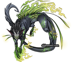
All hail Snafu
xxxx█ ✧ █xxxx
xxxx█ ✧ █xxxx
xxxx█ ✧ █xxxx
xxxx█ ✧ █xxxx
xxxx█ ✧ █xxxx
xxxx█ ✧ █xxxx
xxxx█ ✧ █xxxx
xxxx█ ✧ █xxxx
xxxx█ ✧ █xxxx
xxxx█ ✧ █xxxx
xxxx█ ✧ █xxxx
xxxx█ ✧ █xxxx
xxxx█ ✧ █xxxx
xxxx█ ✧ █xxxx
xxxx█ ✧ █xxxx
xxxx█ ✧ █xxxx
xxxx█ ✧ █xxxx
xxxx█ ✧ █xxxx
xxxx█ ✧ █xxxx
xxxx█ ✧ █xxxx
xxxx█ ✧ █xxxx
xxxx█ ✧ █xxxx
xxxx█ ✧ █xxxx
xxxx█ ✧ █xxxx
xxxx█ ✧ █xxxx
xxxx█ ✧ █xxxx
xxxx█ ✧ █xxxx
xxxx█ ✧ █xxxx
xxxx█ ✧ █xxxx
"The Universe is under no obligation
to make sense to you."
to make sense to you."
-
NightAssassin - Posts: 2474
- Joined: Fri Sep 09, 2016 6:27 pm
Re: Rate the signature and avatar above you!
![]() by Giant Talking Banana » Tue Aug 01, 2017 10:19 am
by Giant Talking Banana » Tue Aug 01, 2017 10:19 am
Actually, we already have one of these threads here ->click!
It would be awesome to revive it though. :)
It would be awesome to revive it though. :)
█
█
█
█
█
█
█
█
█
█
█
█
█
█
█
█
█
█
█
█
█
█
█
█
█

╔════════════╗
║
║
║
╚════════════╝
║
║
║
║
║
║
║
Hello! I'm Giant Talking Banana.
I'm not active anymore, but I like
to keep some stuff on my account
around just for memories' sake.
xxxxxxxx<- Sadgati
--------signature made by me--------
║I'm not active anymore, but I like
to keep some stuff on my account
around just for memories' sake.
xxxxxxxx<- Sadgati
--------signature made by me--------
║
║
║
╚════════════╝
-
:origin()/pre01/0a47/th/pre/f/2015/250/5/6/56ea21dc9fd9f814bf987edb5c1a8421-d98s82u.png)
Giant Talking Banana - Posts: 2447
- Joined: Fri Apr 03, 2015 8:07 am
-
5 posts
• Page 1 of 1
Who is online
Users browsing this forum: No registered users and 38 guests